Four Design Directions for a B2B Tool Maker
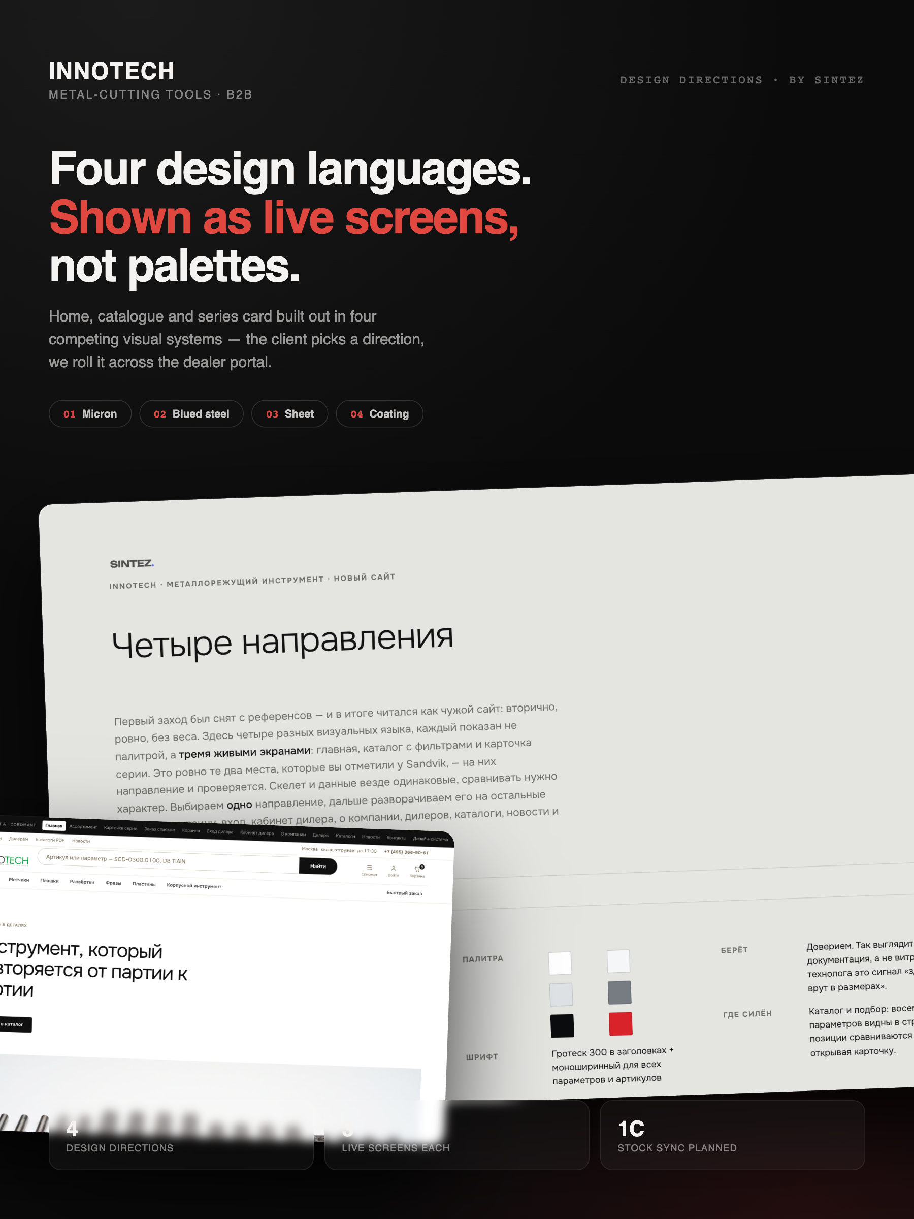
Innotech makes metal-cutting tools and sells through dealers. Their first site redesign attempt was assembled from references — and read like somebody else's site: tidy, secondary, weightless.
Instead of another mood board we built four competing design languages — Micron, Blued Steel, Sheet and Coating — each proven on the three screens that actually sell: home, filtered catalogue and series card.
A palette tells a client nothing about how their catalogue will feel. Industrial buyers judge a supplier by whether the site reads like documentation they can trust — and that only shows on real screens with real product data.
Same skeleton, same data, four characters. Each direction is a working set of live screens, so the comparison is about temperament, not layout. The client picks one; we roll it across the cart, dealer portal, company pages and catalogues.
The failed first attempt and the Sandvik benchmarks dissected: what industrial buyers actually scan on a tooling site.
Micron (measurement protocol), Blued Steel, Sheet and Coating — distinct type, palette and catalogue character each.
Home, catalogue with filters and series card built for every direction — same skeleton, same data, different weight.
The chosen direction expands to cart, sign-in, dealer cabinet, company and news — with 1C stock sync behind the catalogue.
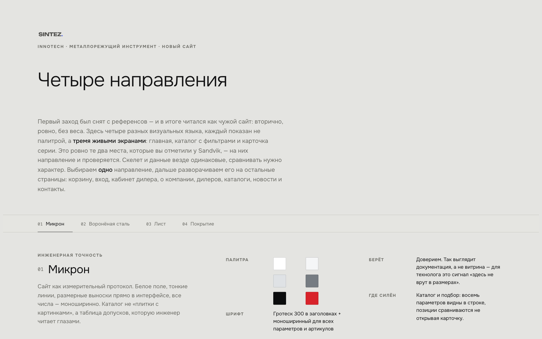
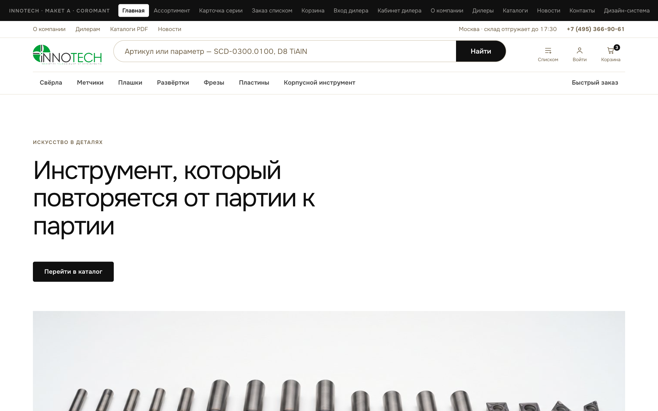
An engineer reads a catalogue like a spec sheet: eight parameters visible in the row, positions comparable without opening the card, mono figures that look like they came off a caliper. You can't judge that from a colour swatch — so we never asked the client to.
“Same skeleton, same data — compare the character, not the layout.”
The numbers that matter
Distinct visual languages, each defensible as the final site — not three fillers around a favourite.
Three selling screens built out per direction, with real product data in every row.
The comparison format collapsed weeks of taste debates into a single working session.
Dealer portal and live warehouse balances planned into the winning direction from day one.